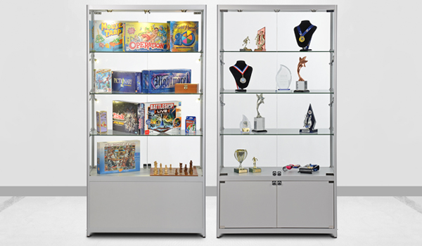
How to Create A Great Display Case That Will Draw Customers to Chosen Items
For good reason, glass displays are extremely popular among retail
stores. You can choose from tower designs or a counter top designs to find what
will work best for showing off your products and bring in sales. Display cases
will draw in your customers while adding value to the content. Customers who
walk over to your display cases will be guided through your various items. To
increase your chances for more sales you need to consider your layout and how
you arrange your items.
You will have so many wonderful options when you start designing your
display cabinets. But first, you must understand how important it is to create
a layout and design that will capture your customers and offer a very pleasing
element. Here are some ideas to get you going and discovering the world of displays:
Placing Items in Order of Size:
Rule of thumb, you should place your largest items on display
first. Once done, you can work around these items to ensure your smaller
products will not be lost or washed out by the larger ones.
Find Your Focal Point:
The best way to find your focal point is to display the most
popular or newest items you have available. You can use a riser to create a
hierarchy and draw viewers to the different objects.
Incorporate Signs:
This is very important in order to allow customers to learn more
about a product such as the cost, what it's made from and if there is a current
promotion for that specific item. Keep in mind, the signs and the holders for
the signs should be neutral in color so they will not take away from the items
on sale. Make sure the signs are close to the product being described and never
have a sign that's larger than the item. Your goal is to display the items, not
their signs.
Your Lighting:
Let's face it, lighting is critical for customers to be able to
view the products clearly. Stay away from placing lighting directly over the
items as this will cause shadows, distorting the overall viewing
experience. Your lights should be
slightly off to the side of the product and you should have more than one light
per item.
Keep It Simple & Neat:
Don't go overboard in displaying your items. If you add too many
items, your display will become crowded and not come across as appealing. Items
will not show off their best qualities because they are all on top of each
other. The idea is to have enough space between items so each one will have
their own area to show off their features.


Comments
Post a Comment